Examples of game manuals
Posted: Tue Oct 11, 2011 18:40
1. Here's one I'd consider to be inferior to many of the books released by big publishers:
http://breandan-ociarrai.deviantart.com ... -255069428 ...seems to be a hobby project (kudos, you can tell they have struggled with it and I'd love to get a copy for free..) that they sell.
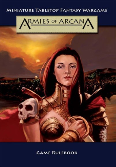
2. What we have: http://newworldgamingco.files.wordpress ... cover1.jpg
..should remind pretty much about what we currently have. Personally I like it, but it doesn't measure up with what's on the market. I also think they should have picked another font, don't know if they want to give a steam-punk or wild-west feeling with it...
3. Classic Roleplaying; http://www.keepwargaming.co.uk/ekmps/sh ... 1186-p.jpg ...looks okey but oldschool layout. They haven't struggled with it. Crappy pick of main art as well. Good combo of red and gold, also nice loggo-stuff. Minus for the squareish shit on the frame.
4. Mercs: http://www.maelstromgames.co.uk/store_m ... _large.jpg ...probably one of my favourites and a really good looking piece. Good bg texture and really nice logo. Main art leaves something better to wish for, and subtitles should stand out less. Ditch the ego-shit-text - who gives a shit who designed the game when those guys are probably unknown anyway when it's released. In real life only like 0,5% of the persons that will buy that game will ever care or buy it because of who created it. Really. I want to play this game based soley on its kick ass cover... if it just werent for the crappy-laserish-sword...
5. Flames of War: This game is a classic and well known. Also classic an cheap setup of its cover: http://www.janco-toys.com/images/P/janc ... Book_a.jpg ...it doesnt even mind-meld together. Wargamers are howveer used to shitty graphics and nobody will mind.
6. All Warhammer 40 000: Same implemenation as above, maybe slightly better. http://importhobby.com/u/31/326721/1583751.jpg ...this is so typical of GW, whose art picks have always disturbed me. I wouldn't ever want us to use such a detailed piece of art as a cover. Way way too much info, it looks chaotic and you really have to look at it for a while to make sense of it.
7. Same as above, other game: http://lh4.ggpht.com/_xNoM2NfE42A/Tc8cl ... image3.png ...nice looking logo-section, rest is disaster. Reeks 90's.
8. Really nice one... https://lh5.googleusercontent.com/-NKCT ... e+book.jpg ...albeit a little too much info/art. I'd happilystickwith it and just simplify.
9. More 90's a la powerrangers: http://www.beastsofwar.com/wp-content/u ... -cover.jpg ...good idea gone wild... too much of everything.
10. Really classy: http://www.lonegunmangames.com/resource ... 02x579.jpg ..albeit too simplistic.
11. Magic: http://2.bp.blogspot.com/-o1FEGKpwGk4/T ... e+Book.jpg ....not bad, at all. Would still cut down somewhat on the weight of the deco.
12. http://www.mongoosepublishing.com/media ... Q2_1_2.jpg ...nice, but wouldnt work in the proper format as cove without becoming too much.
13, Star Wars CCG: http://images.wikia.com/starwars/images ... lebook.jpg ....hrm.. text and art doesnt play well in top right corner. Else they were on the right track with it. I redid it in 3 sec and it already looks better, see attached crap.
14. I'm dazzeld >> http://www.brueckenkopf-online.com/wp-c ... -Cover.jpg ...think it looks pretty good and makes a strong statement. Nice choice of fontface...Has detailed art yet it doesnt interfere too much...
http://breandan-ociarrai.deviantart.com ... -255069428 ...seems to be a hobby project (kudos, you can tell they have struggled with it and I'd love to get a copy for free..) that they sell.
2. What we have: http://newworldgamingco.files.wordpress ... cover1.jpg
..should remind pretty much about what we currently have. Personally I like it, but it doesn't measure up with what's on the market. I also think they should have picked another font, don't know if they want to give a steam-punk or wild-west feeling with it...
3. Classic Roleplaying; http://www.keepwargaming.co.uk/ekmps/sh ... 1186-p.jpg ...looks okey but oldschool layout. They haven't struggled with it. Crappy pick of main art as well. Good combo of red and gold, also nice loggo-stuff. Minus for the squareish shit on the frame.
4. Mercs: http://www.maelstromgames.co.uk/store_m ... _large.jpg ...probably one of my favourites and a really good looking piece. Good bg texture and really nice logo. Main art leaves something better to wish for, and subtitles should stand out less. Ditch the ego-shit-text - who gives a shit who designed the game when those guys are probably unknown anyway when it's released. In real life only like 0,5% of the persons that will buy that game will ever care or buy it because of who created it. Really. I want to play this game based soley on its kick ass cover... if it just werent for the crappy-laserish-sword...
5. Flames of War: This game is a classic and well known. Also classic an cheap setup of its cover: http://www.janco-toys.com/images/P/janc ... Book_a.jpg ...it doesnt even mind-meld together. Wargamers are howveer used to shitty graphics and nobody will mind.
6. All Warhammer 40 000: Same implemenation as above, maybe slightly better. http://importhobby.com/u/31/326721/1583751.jpg ...this is so typical of GW, whose art picks have always disturbed me. I wouldn't ever want us to use such a detailed piece of art as a cover. Way way too much info, it looks chaotic and you really have to look at it for a while to make sense of it.
7. Same as above, other game: http://lh4.ggpht.com/_xNoM2NfE42A/Tc8cl ... image3.png ...nice looking logo-section, rest is disaster. Reeks 90's.
8. Really nice one... https://lh5.googleusercontent.com/-NKCT ... e+book.jpg ...albeit a little too much info/art. I'd happilystickwith it and just simplify.
9. More 90's a la powerrangers: http://www.beastsofwar.com/wp-content/u ... -cover.jpg ...good idea gone wild... too much of everything.
10. Really classy: http://www.lonegunmangames.com/resource ... 02x579.jpg ..albeit too simplistic.
11. Magic: http://2.bp.blogspot.com/-o1FEGKpwGk4/T ... e+Book.jpg ....not bad, at all. Would still cut down somewhat on the weight of the deco.
12. http://www.mongoosepublishing.com/media ... Q2_1_2.jpg ...nice, but wouldnt work in the proper format as cove without becoming too much.
13, Star Wars CCG: http://images.wikia.com/starwars/images ... lebook.jpg ....hrm.. text and art doesnt play well in top right corner. Else they were on the right track with it. I redid it in 3 sec and it already looks better, see attached crap.
14. I'm dazzeld >> http://www.brueckenkopf-online.com/wp-c ... -Cover.jpg ...think it looks pretty good and makes a strong statement. Nice choice of fontface...Has detailed art yet it doesnt interfere too much...