Style Guide
| |
Under Construction
These pages are under heavy construction & only intended for the developers. Notice that most of the info will change.
|
This style guide is around as aid for artists and to give them a clearer picture of what is expected by the WTactics developers on the visualization front of the project. We will give short textual introductions and some clear examples of what we think could be good references of how it could look like aesthetically in our universe as we picture it. One of the important main goals for every artist working on this project is to make the art feel consistent in style. All artists that can deliver that, a feeling for detail, good dynamic poses and scenarios, are more than welcome to apply for a position and become a part of the staff.
Notice that this document is meant to be a brief introduction: You must always consult with a developer that's responsible for whatever work you're doing before you actually start doing anything at all. We usually grant great artistic freedoms, love to listen to your ideas and expect there to be plenty of playroom outside the scope of what is written in this document. As such, this document isn't around to limit creativity - it's here to make sure we have unified style.
Freedom
Unless you are hired by us we will not force you into obeying any rules. We are not a government-like organization here. You're in charge of your own time and creative habits. We don't even give you exact deadlines.
The worst that can happen is that we won't use your artwork. In such a case you would have lost some time, but we would tell you how we came to reach our decision. If you then revise it and provide us with a corrected version of it we will use it if we deem the problems resolved.
Aestehtics: Core definitions

What is considered to be aesthetically appealing, good, bad, beautiful, ugly or technically skilled et.c. within the frames for this project is decided by the art director(s) or other appointed developers of the project. Except for some of our design goals and what can be deducted from our overall tone in the game and the world we're populating, it is purely a subjective matter. That said, the verdict that falls is what we will adhere to. Somebody has to make the decisions, and we have chosen to use this model.
We only accept art that according to our own standards is of an adequate or high quality. Nothing that looks bad to us get onto cards. The art should be:
- Realistic.
- Illustrative.
- Properly made on separate layers.
- Usually in no need of a background.
Specific style
- Anatomical correctness and realistic illustrative approach is really valued.
- Composition needs to keep in mind that we will use it for our purposes.
- Palette and style should match the faction that piece of art will belong to.
Most of the artwork will be used as illustrations on our cards with text above or on the side. Small sized & printed. Sometimes, however, we would likely use it in other ways too, for example to make posters or for use on our site(s) or advertising. We also use the very same illustrations/cards in our digitial version of the game, where the cards are much bigger than when using paper as media. Because of that all art must be high resolution in it's original state and have an absolute minimal original DPI of 300. Preferably you would use 600 DPI.
Proposed workflow
Creation
We have developed specific and easy to follow workflow to be effective and that will reduce the amount of things that will go wrong. It consists of these three stages:
- Creating a detailed sketch that will show composition and the most important details.
- Creating black and white lineart.
- Colorization.
Evaluation
The work must always be evaluated and cleared by the appointed developer before it can be taken to the next step in the process by the artist. Thus the evaluation process is intertwined with the creation process and goes back and forth.
In most cases small revisions will have to be made before it reaches the final step. The work is of course also evaluated and cleared after the suggested final coloured version has been created by the artist. Usually we strive to have cleared as many issues as possible in the first two steps and avoid demanding total make-overs once the colouring has been done. Adjustments of colours may still be needed though, making it imperative that plenty of proper layers have been used in the process if one wants an easy time adjusting them.
Detailed
Gaian
The Gaian faction is mainly made up of three species: Elves, Merfolk and Humans. In that given order. Gaia is the faction that is most intimately connected to the force of nature and what is natural, pure and untouched. They love eachother, use life, growth and peace to defeat their enemies.
Elves
The elves are the generic ones in the world of fantasy: Tall, slender, pale skin and usually but far from always blonde. They have the classic pointy ears and a body that is seldom filled nor very muscular. They're agile, are seldom portrayed as aged, and they're relatively fragile compared with most other species.
The elves primary palette utilizes olive, deep and browny green as the main colours of their cloth. Wine red, purple and white is also seen. They usually prefer to keep close to colours that can be found in nature and the forests they dwell in. This may however differ if an eleven VIP is depicted, or when it comes to small ornamental details such as e.g. a flower in the hair.
Keep in mind that elves are of ancient heritage and a culture that values the good deeds, mother earth, simplicity, friendship and tradition. They are elegant, even when dressed in the most modest clothes, and rarely appear dirty or with weapon rusty or otherwise defect equipment.

Archer, by Kitty
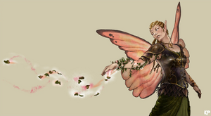
Fairy Queen, by Kitty
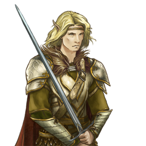
Elornas, by Kitty


Merfolk
The Merfolk are sea creatures, so they will have fishy or toned down sharky skin tones. They are for the waters what the elves are for the forests. They have similar values as the elves and also share their close relationship with the earth, albeit in the vast waters. They are depicted as very close to nature, almost au natural, lacking all gear or only using sparse equipment or clothing that is apparently made of natural materials. The exceptions to this are most of their military units that use armour/scale of strange rustproof metals or skin, shaped into natural forms of e.g. shells. The Merfolk are more visibly muscular than elves, yet still often skinny.
The Merfolks are somewhat more prone to pick up arms than it's more forgiving elvish counterpart. They also have a military discipline and culture that remind very much of what could be described as Atlantian inspired or one with strong aestehtical connections to the earthly Roman Empire.
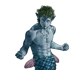
Brawler, by Kitty

Gwabbo, by Kitty
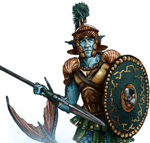
Merman Hoplite, by Kitty

Merfolk Oracle, by Santiago Iborra

Priestess, by Kitty


Red Banner
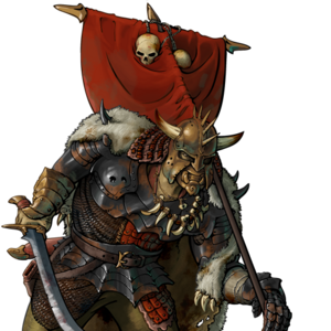
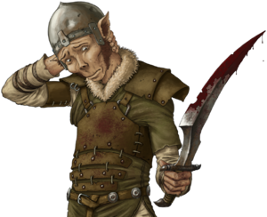
The masses are about to revolt, and the Banner is seen as the peoples army, composed of all stratas from the poor, oppressed and unjustly treated. You can find members from any species in the Red Banner, but Orcs, Goblins and Humans are dominant. Orcs are big and brutal leaders with a long experience conflicts and proud heritage, goblins their smaller, skinnier version that's fast and alert. The Red Banner army usually uses scavenged or otherwise improvised gear, neglected, unrepaired and often more blunt and rusty than shining and sharp. They use colours of earth for camouflage, mostly brown. You can find almost anything in their possessions - from simple war machines to bizarre artifacts. The Banner will use all means it has to insure vitctory. Typically and with few exceptions only the Orcs wear the red uniform.
Orcs
Sovereign, by BfW

Warrior, by BfW

Grunt Six, by BfW

Crossbowman, by BfW

Grunt Four, by BfW


Goblins
Confused Goblin, by Santiago Iborra

Goblin against wind, by Santiago Iborra


House of Nobles
are excellent diplomats and trained troopers. If they're unable to solve their politics by espionage or trickery, they will pay their best soldiers of fortune to do the task quickly and effectively.
Items, spells, enchantments, events


Essentials for all factions
More a quick summary than anything else - but still things we care about!
Linear art
We make heavy use of contour and its line to build the image. Forget about Caravaggio-like chiaroscuro - better to look at van Eyck or Giotto masterpieces. Note that contour is not black, and it's used actively to help with the perception of volume and mass of bodies.
Light and shadow
We don't like realistic lighting, really. Light and shadows should, in general, be barely visible. They should certainly never dominate. We like clarity more than dramatic effect.
Palette
Each faction has a limited set of colours bonded to it. If you want to clothe your elven warrior in a bright red shirt we'll (probably) object. If this point seems unclear please take a closer look at what's been done so far. We love creativity, but also want cards of the same faction to appear fairly cohesive.
Clothes
We pay a lot of attention to clothing and decorative patterns on clothes, and we like them to look suitable (and, indeed, to contribute) to who or what is being depicted. If in doubt then take a look at the art we already use, and at fantasy and medieval paintings and illustrations. Within these (we hope rather loose) bounds, though, please feel free to be as inventive as possible.
Professional workshop
Anatomical correctness is a must. So is the correct use of perspective, colour, light and shadow, contour, composition, mass and so on... To be honest, if you're doing things right, you probably know it all. If you don't know something, we are happy to point you in the right direction. Even our most accomplished artists still offer constructive criticism and suggest corrections to one another - that is how good card art is usually born.
That said, if what you really need is a tutor, this is probably not the best place to be looking. You will receive more and better feedback from the members of sites like deviantART[[1]] or conceptart[[2]] than you will from us. One of the main reasons those websites exist is to help aspiring artists blossom. We, on the other hand, are a supportive community focused on creating a great open source strategy card game!
Composition
This is hard to learn but very, very important. Even if art looks good - in fact, even if it looks really good - poor composition may make it useless to us. Why?
It is important to remember that your art is going to appear on cards - and that means it will be framed by certain lines, text and colours. Look at how our cards are laid out. We do our best to make sure all the art we use is presented as beautifully as possible, but poor composition could mean it doesn't fit, or it blends too much into the background, or... Hopefully you get the idea.
Additionally, if you can make some elements of the card design and your art complement each other - by, for example, finding a vibrant colour that fits or contrasts well with a card's background, or by shaping a rhythm between details on a weapon, jewelry or cloth pattern and a card's typography or frame - that would be fantastic.
Most of us live in cultures utilizing LTR text direction, but some people write in other directions. Because of this, it is entirely possible that 'mirror versions' of WTactics cards will be produced. This means that, among other things, your artwork may be depicted as you intend it and/or in a horizontally 'flipped' form. It may therefore be advisable to forgo the use of some specific things - such as real-world linguistic symbols or signatures - unless you are happy with a 'mirror version' of such things being shown.
Be creative
Surprise us. Show us your ideas. Do a weapon or dress survey, blending your creativity and imagination into the WTactics universe. Provide us with something really special. We love decent work and would love to show it off. We don't have super-cool typography and eye-catching card backgrounds for no reason: it's for you, and for your art - so that it can be shown off with a minimum of distracting clutter, to maximum effect.
"No go"-s
There are really only three things that will stop your work from being used on our cards:
- Something obviously out of place is depicted - no motorbikes or UFOs!
- The style doesn't match the other art we have here. No manga, nothing manga-like, no photography, and no photorealism.
- The quality of the art is not high enough. The WTactics community is dedicated to producing a quality game that is a pleasure to play, and to that end we go to a lot of effort to make sure only quality art appears our cards - our apologies to all you beginning artists, but perhaps you could try your hand at something simple?
Deprecated
The below art exemplifies pieces that we currently have or had in the game and which we try to replace and move away from for whatever reasons that makes the pieces stylistically problematic. In essence, all piece that seem to not be stylistically compatible with what has been displayed in the previous sections should not be a part of the game. Please notice that deprecated stylistical features aren't the artists fault - it's something that the developers of WTactics are fully responsible for.

Serenity, by unrealsmoker

Bound by Love, by unrealsmoker


Type
Initials
Cards, and in particuar non-creature cards, make use of an initial (drop cap) if the card text is not:
- On the first two card text lines.
- A keyworded ability, as they are written in bold and conflict with intials.
- In a card text area with a keyworded ability or another initial around.
- Shorter than two full or almost full lines to the right of the intitial.
- Initiated by stating a cost, like for number the character 3 in the card text
3 gold: Mark target creatureor the letter D inDiscard a card from hand: Pick a card at random in your oppponents hand. View it, and give it back to him/her. - Crammmed into the card.
- A vicitim to reduced font size.
- Really a symbol instead of text, such as for example the
 (mark) symbol.
Use drop cap
External resources
- Battle for Wesnoth has a great site with a good number of highly relevant tutorials and resources.
- They also have external links to lots of other excellent sites.
- Additionally, there are plenty of videos and other materials available online - just try to find it and just look around. You might have luck :)